Ferrari of San Diego — Website Redesign
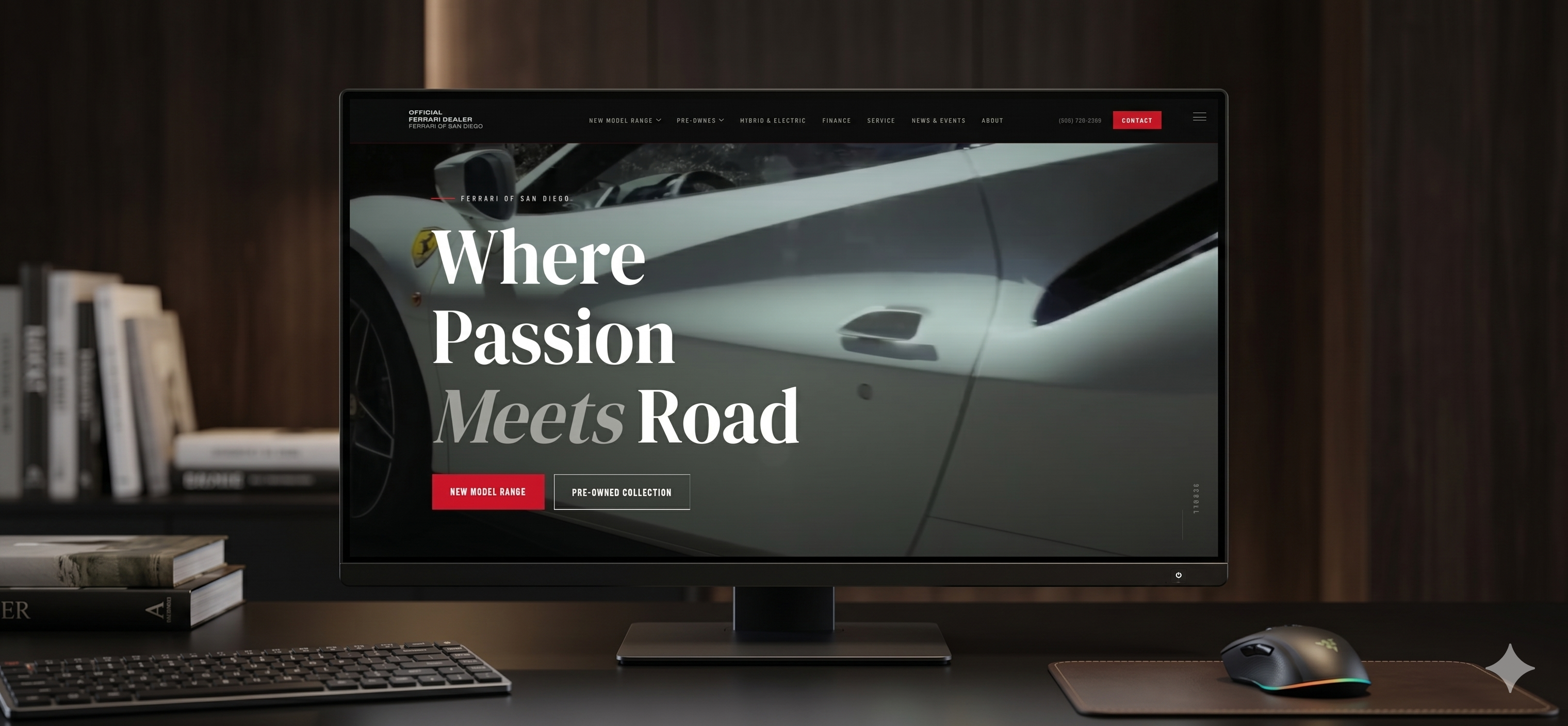
Most car dealership websites, even for luxury brands, look virtually the same: generic catalogs, unappealing contact forms, and a design that could belong to any brand. For a marque like Ferrari that's a huge waste, because the website is often the first contact someone has with the dealership, and that first impression has to live up to what they're about to buy. As a self-initiated concept by Norvex (not an official commission from the dealership), we set out to show how the Ferrari of San Diego site could look if it felt as premium as the cars it showcases.
We designed a proposal built around a single idea: the car is always the protagonist and nothing distracts from it. An elegant, minimalist layout puts each vehicle front and center. Navigation is simple and direct, so finding a model, viewing its details, or contacting the dealership is immediate, with no unnecessary steps. The experience is fully responsive, because a large share of visits now arrive from mobile and it has to feel premium there too. And every screen is focused on generating real contact, with clear calls to action that move an interested visitor from just browsing to wanting to talk to someone. The same design logic could be applied to other locations of the brand.